UI Design of a banking application
Design a responsive banking application for a challenger brand looking to make waves in the financial world. They want an intuitive app that will help them stand out from the crowd.
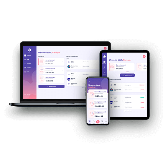
After successfully completing the Diploma in UX Design with the UX Design Institute, I decided to brush up on and expand my UI knowledge with their certificate in UI Design. The course took me 3 months to complete and the course assignment consisted of creating mood boards, responsive screen designs for a banking platform and a reflection document.
My Role
Solo UI design project where I created mood boards, chose a colour palette, icons and fonts and designed user interfaces for three screens on desktop, tablet and mobile.
Timeline
March 2022 - June 2022 alongside the course modules.
Tools used

The brief
Create a a fresh new interface for a new responsive banking application. The client is a challenger brand looking to make waves in the financial world. They want an intuitive app that will help them stand out from the crowd.
Brand tone
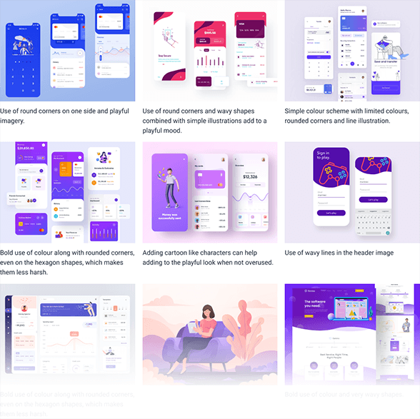
Playful: Using our product should be a joy for users. We're not afraid to show some personality through colour, animation and shape, but never at the cost of being intuitive.
Clear: We're dealing with people's money, so we need to present information in a logical and uncluttered way.
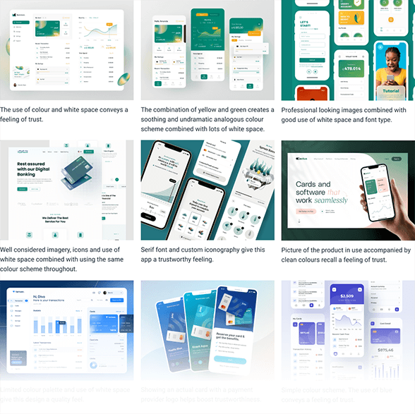
Trustworthy: Users must feel they can trust our product.
Mood boards
Creating a bank of reference
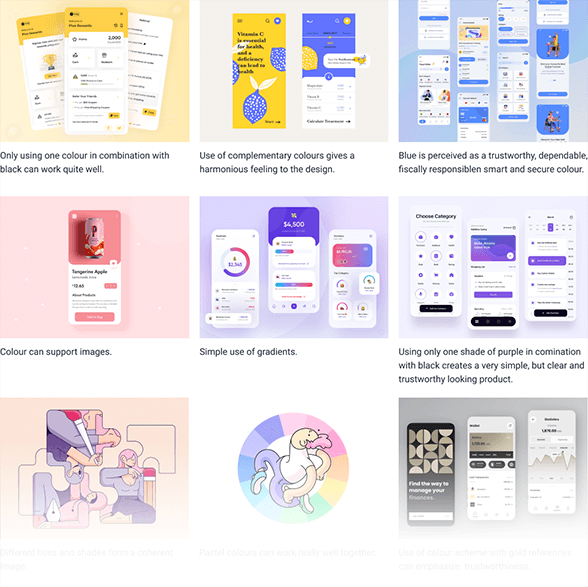
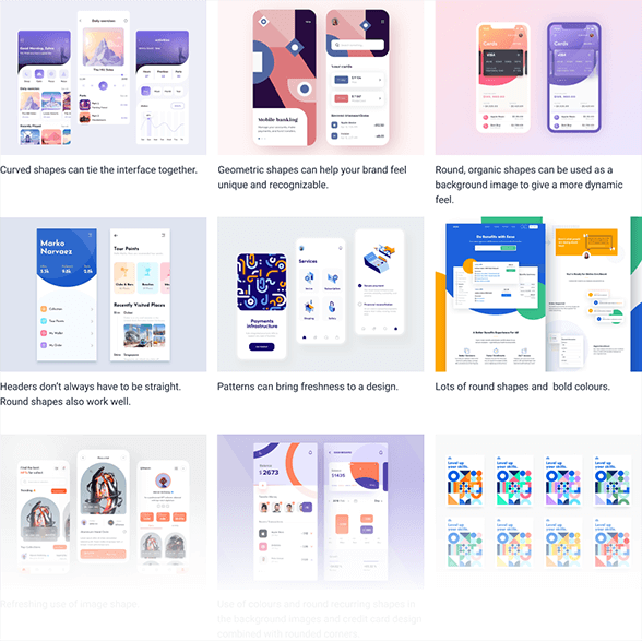
The first assignment consisted of creating a set of mood boards that could later act as a source of inspiration for the screen design of the banking application. Alongside mood boards for Colour, Shape & Typography there were also 3 mood boards representing the brand values Playful, Clear and Trustworthy.
Playful
Clear

Trustworthy
Colour

Typography
Colour
Low-fidelity wireframes
Designs on paper
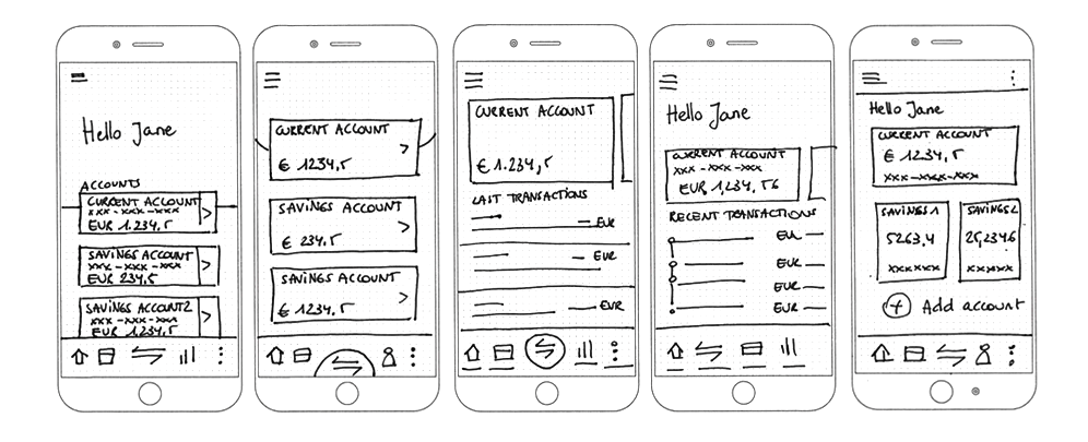
If the UX course tought me anything, it is that it's best to start out with pen and paper. It's a quick way to get ideas down on paper and figuring out basic information architecture. The course provided some basic wireframes to start out with as well.
Design system
Consistency is key
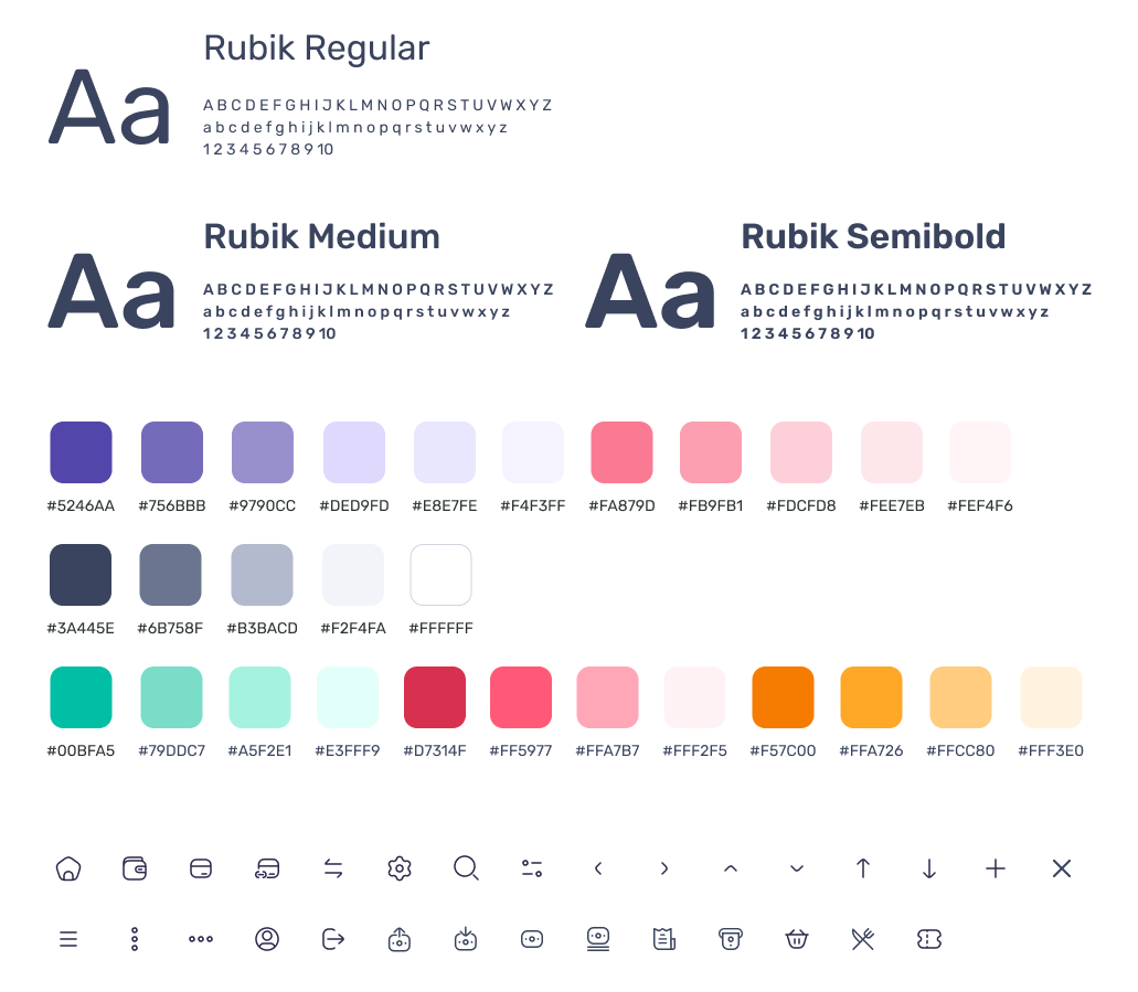
To maintain a consistent look throughout the product, a design system is essential. At the start of the design stage I picked fonts and a colour scheme that matched the brand values and I created a library in Figma for ease of use and consistency.
Final screens
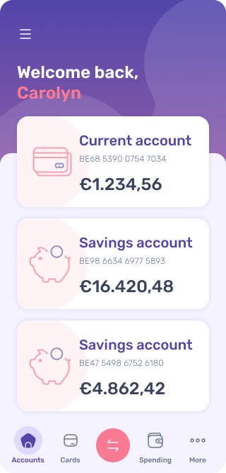
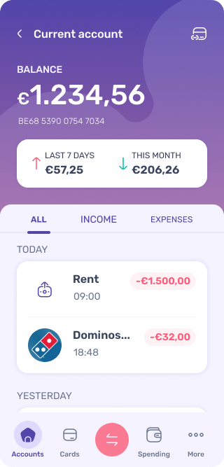
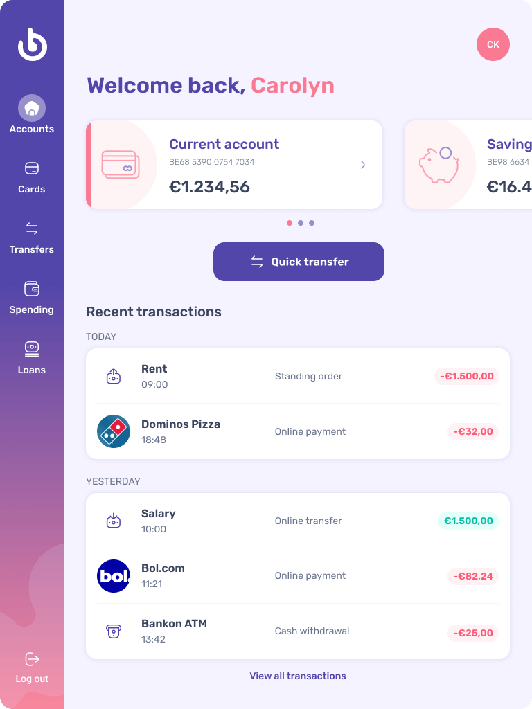
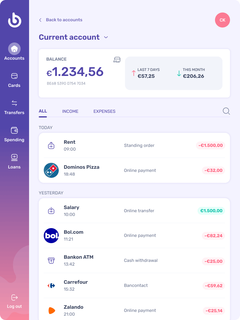
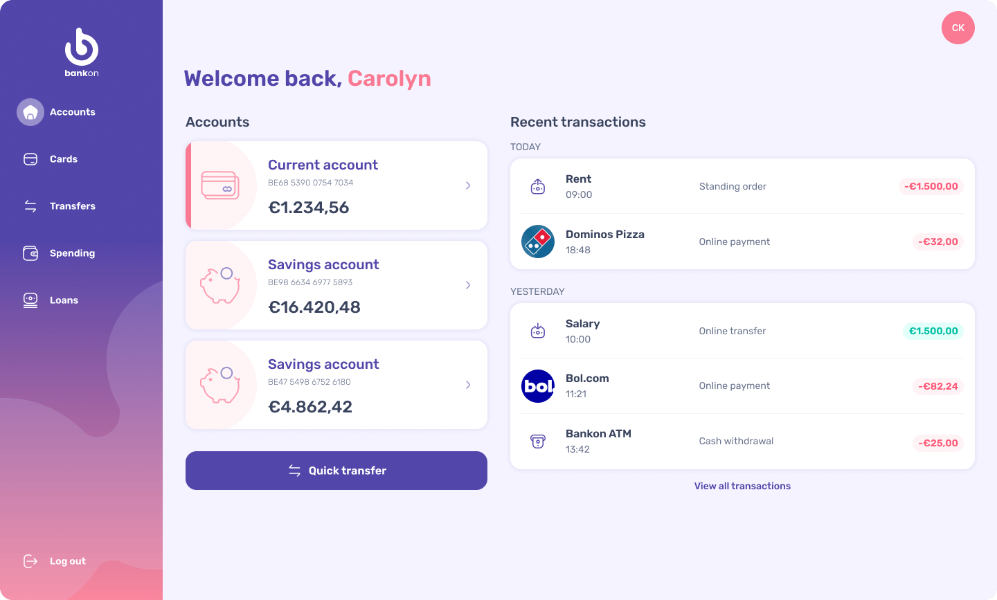
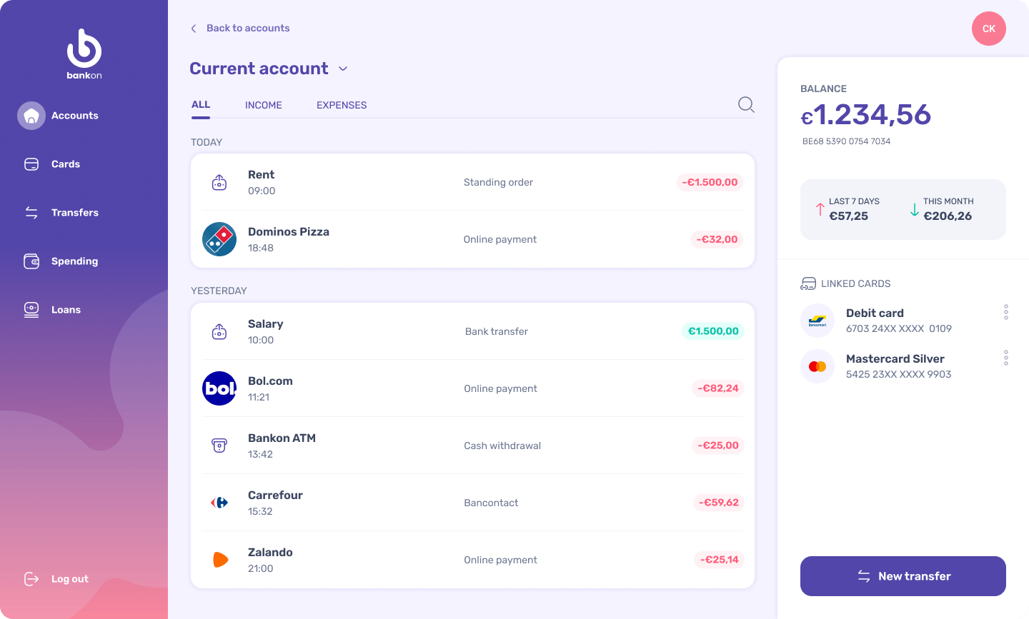
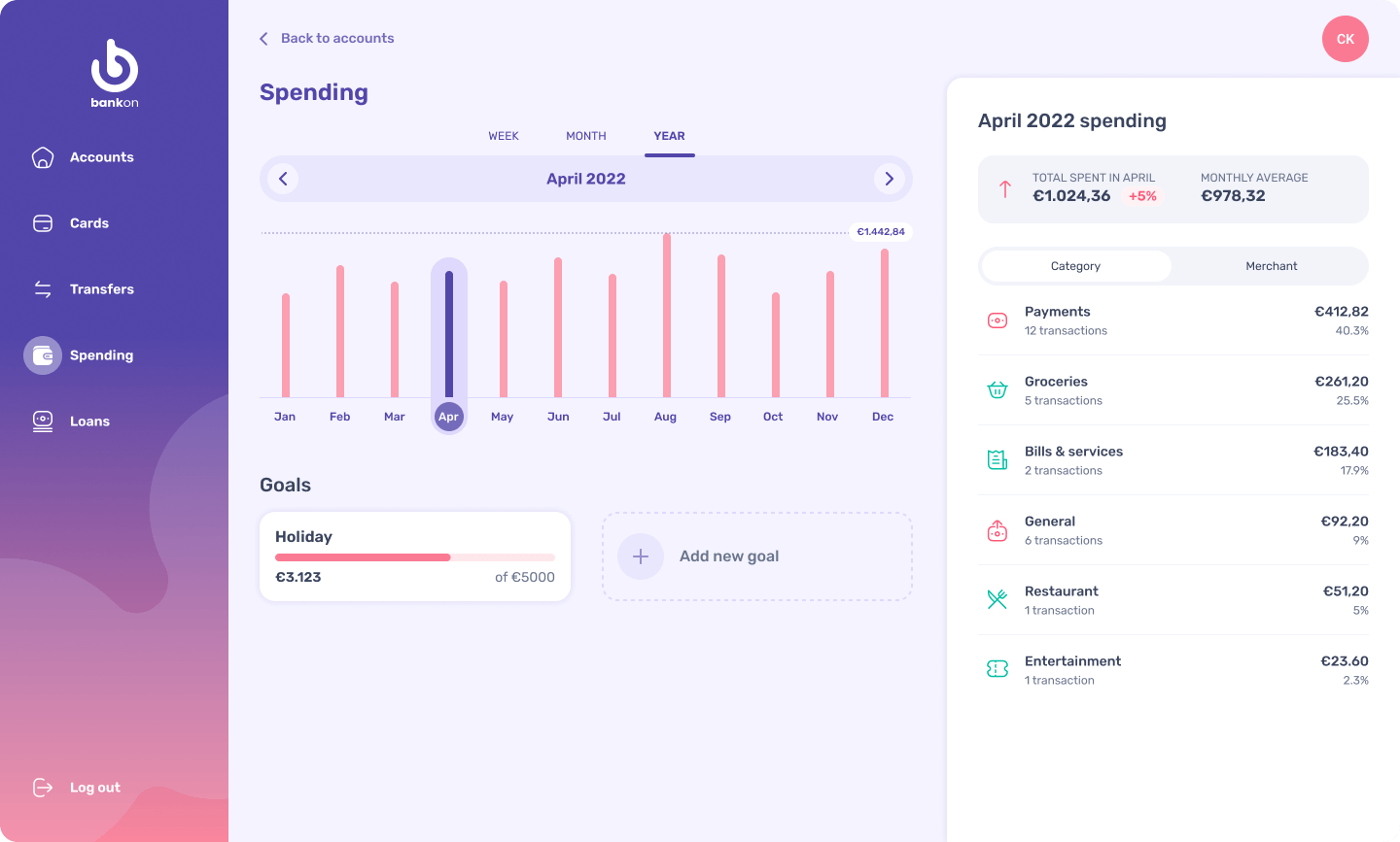
The final screens consisted of a dashboard, account and a spending screen. They had to work responsively on mobile, tablet and desktop.
Mobile

Tablet

Desktop
Reflection
Which parts of my assignment am I particularly happy with?
When I started with this project I wanted to create a design with soft edges and organic shapes, but still a trustworthy and clear feel. I decided to use a blue leaning towards purple for its association with trustworthiness. The pinks add a more fun and not so serious note. The font I chose is a modern, versatile and easy to read sans serif and its rounded corners convey a little bit of extra playfulness. The design has a consistent look and scales nicely on the different screen sizes, making it look like a cohesive product.
Which parts of my assignment am I less happy with?
While I think the design both represents the brand principles “clear” and “trustworthy” quite well, I still feel it lacks a bit regarding “playful”. This could of course be solved within other screens by adding more playful visuals.
The “Quick transfer” button on the “My Accounts” screen also keeps bugging me. Not knowing the exact purpose of this button made it hard to figure out what to do with it and it still feels a bit lost.
I could easily show linked cards on the “Current Account” desktop design, but then had to find a way to represent this on both mobile and tablet. The icon works quite well on mobile, but I'm not convinced it is in the right place on tablet.
During the feedback session after submission of my design for grading, it was pointed out that on the dashboard screen of the desktop version the first account is highlighted to indicate that its transactions are show on the right and it isn't entirely clear how that would work for the other accounts. I totally agree with that and I would need to rethink that part for a next iteration.
However, these are all quite minor issues and overall I'm quite happy with the design.
What would I do differently if I had unlimited time to work on the assignment?
Since I am quite a perfectionist, I could tinker with this design until the last syllable of recorded time. There are always areas to improve or change.
If I had unlimited time I would spend more time on the wireframe/black and white stage instead of diving in at the deep end. I went over this step a bit too quickly and ended up with a lot of different designs and ideas in this initial stage.
Additionally, more competitor research could have helped to see what kind of solutions are out there and it could have given me valuable insights on how to solve problems I was struggling with later on.
Lastly, I would also have liked to test it on some users to see if there are specific issues with the design that prevent them from completing their tasks.
Overall I really enjoyed the course and the challenges the design assignment brought with it along with the insights of the course modules.