UX Research and Design of an airline website
Design an improved flight booking experience for a startup airline which is looking to create an online booking experience that is fast, intuitive and easy.
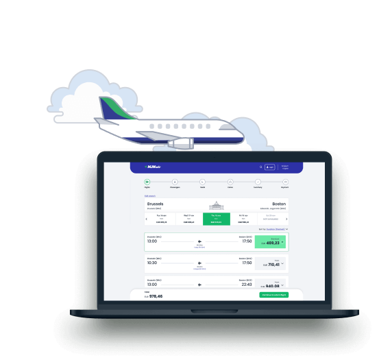
The entire project took me just under 6 months to complete and made me go through the complete UX design process: research, analysis, concept and design. The endpoint was to design & build a prototype and create a detailed set of accompanying wireframes ready to hand over to the developers.
UX Techniques Used
- Competitive benchmarking
- Affinity diagram
- Customer Journey Map
- User Flow Diagram
- Wireframing & Prototyping
- Usability testing
My Role
Solo UX project where I performed all of the roles following the full UX design process.
Timeline
August 2021 - February 2022 alongside the course modules.
Tools used

How are other websites solving the problem?
Competitive Benchmarking
To learn more about best practices and conventions I did an in-depth analysis of 3 competitors and 1 aggregator: Brussels Airlines, KLM, Ryanair and Expedia. Going through the booking process on each website I quickly learned how these best-in className websites solved problems, what they did really well, what the conventions were and what could be improved.
Along the way I took screenshots and colour coded pain points, positives and functionality working as expected.
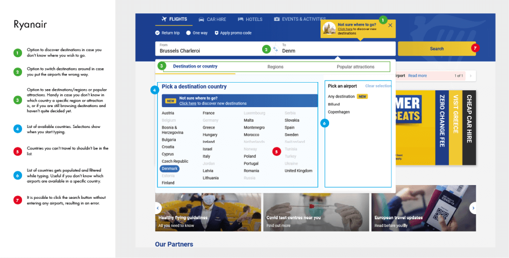
Insights
All of them used a somewhat similar way to book flights, but some suffered from information overload and small print which made it harder to flow through.
How do users feel about the current solutions?
Usability Testing
Next up was conducting my own usability test to gather richt insights from users. Since the airline I'm designing for doesn't have a website yet, I used it to conduct a comparative test. Along with a brief interview I had the user complete a task on 2 different airline websites: Swiss Air and Iberia.
The user was asked to:
- Book a flight from Brussels to Zürich/Barcelona
- Depart on a Saturday
- Last weekend of November
- 7 nights
- 2 adults
I deliberately picked 2 sites I hadn't used in the comparative benchmark to get even more insights. The test showed me how a user navigates through the booking process and what the pain points & positive experiences were. I also watched 2 additional usability tests provided by the UX Design Institute.
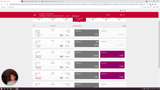
“The flights aren't ordered like I would expect. It makes no sense. They order by departure time, but don't do it for flights with stops.”
Insights
- Users prefer using a calendar rather than typing a date
- Users feel tricked when presented with the extras
- Selecting a fare isn't always intuitive and users can't find how to proceed
- Users like smart defaults to save time
- Users don't like too many fare options, or options that don't warrant a significant price difference
Note taking
After having watched/conducted the usability tests my note-taking skills were put to the test. My notes needed to be concise and detailed at the same time. I colour coded goals, behaviours, positives and pain points for easy reference later.
What to do with all this unstructured data?
Affinity Diagram
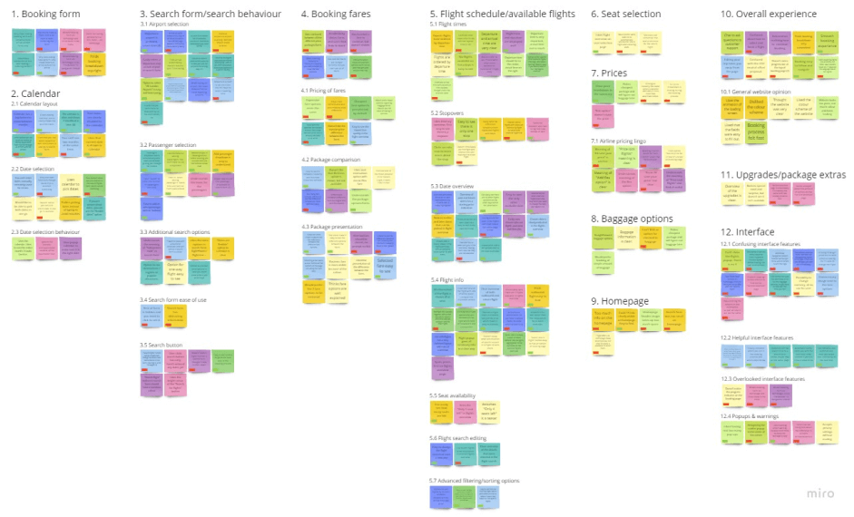
Now it was time to try and make sense of this large amount of raw qualitative data. Together with my partner I went through the research data from the usability tests and competitive benchmark. We put findings and observations on post-it notes in Miro and colour coded based on the project the data was gathered from. Next we tried to group them into logical groups trying to get as granular as possible. We discovered 12 groups, which each could be subdivided again in smaller ones.
What is the customer experience like?
Customer Journey Map
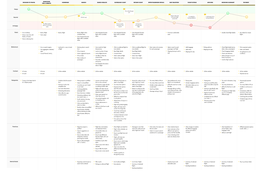
Based on (most of) the categories from the affinity diagram I created the steps of the (overall) user journey. Next I added their goals, behaviour, context, pain points and positives and the corresponding data. After finishing I had a highly structured overview from the customer's perspective which highlighted the key aspects that should be fixed.
Insights
Entering search data didn't really pose a problem. Users got mostly confused when selecting flights, fares and seats. When arriving at the add-ons and extras they felt annoyed and afraid they would be tricked. These areas would need most of my focus.
How does the user flow through the structure?
Flow Diagram
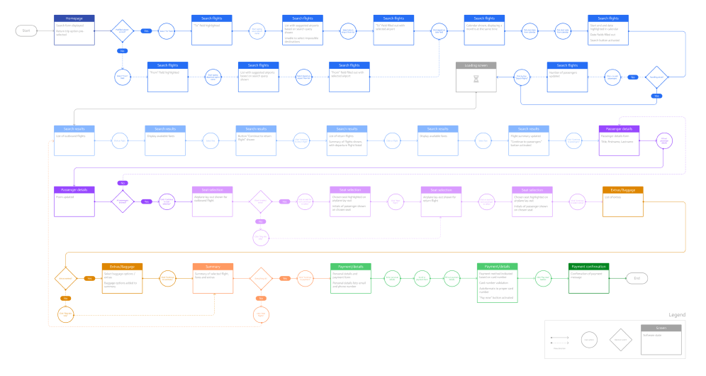
Using the findings from my research and analysis, I drew the high level flow for a single use case starting at the homepage and ending with the payment confirmation screen. Mapping the flow helped me understand all the steps the user needs to take to complete a booking in the most efficient way.
Figuring out the interaction design
Sketches / Low-Fidelity Prototype
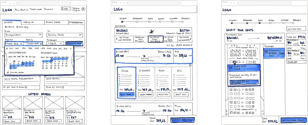
After defining the overall structure, it was time to draw the different screens. Using the flow diagram as a guide I drew all screens using pen and paper.
The most important areas were the search box on the homepage, the flight selection and seat selection.
Some screens took a few iterations to get a result that was clear and easy to use and followed the conventions I discovered during research.
Buttons were scrapped or put in a different location, form fields were changed around and entire screens redrawn.
Designing the solution
Medium-Fidelity Prototype
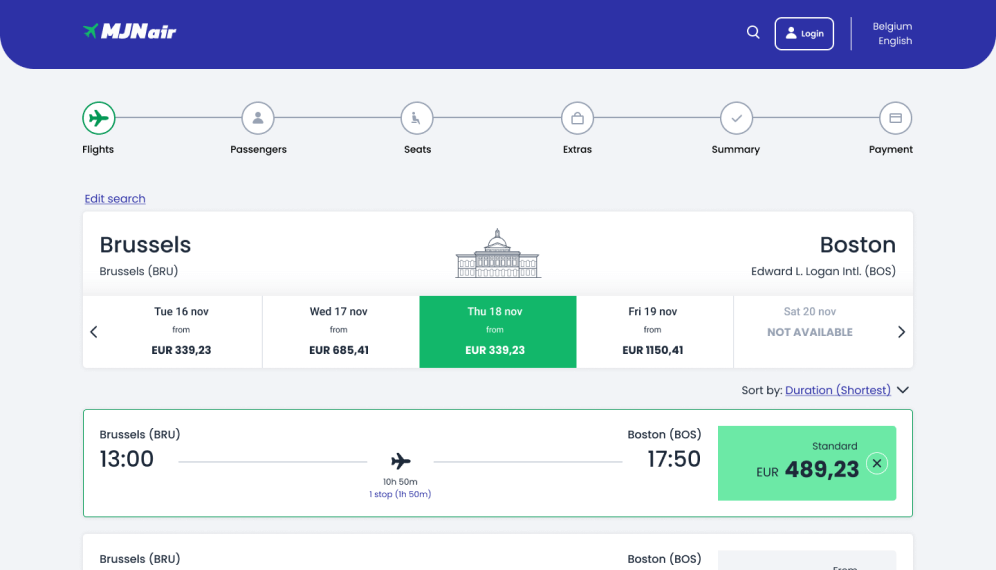
With all the screens finished on paper, it was time to start building the prototype in Figma. The prototype has all the necessary detail to test the high level flow, interactions, screen layout, copy and labelling.
Style Guide
While this wasn't necessary for turning in the project for grading, I couldn't take off my designer hat and created a small style guide to use in my medium-fidelity prototype.

Communicating the solution with the developers
Wireframes
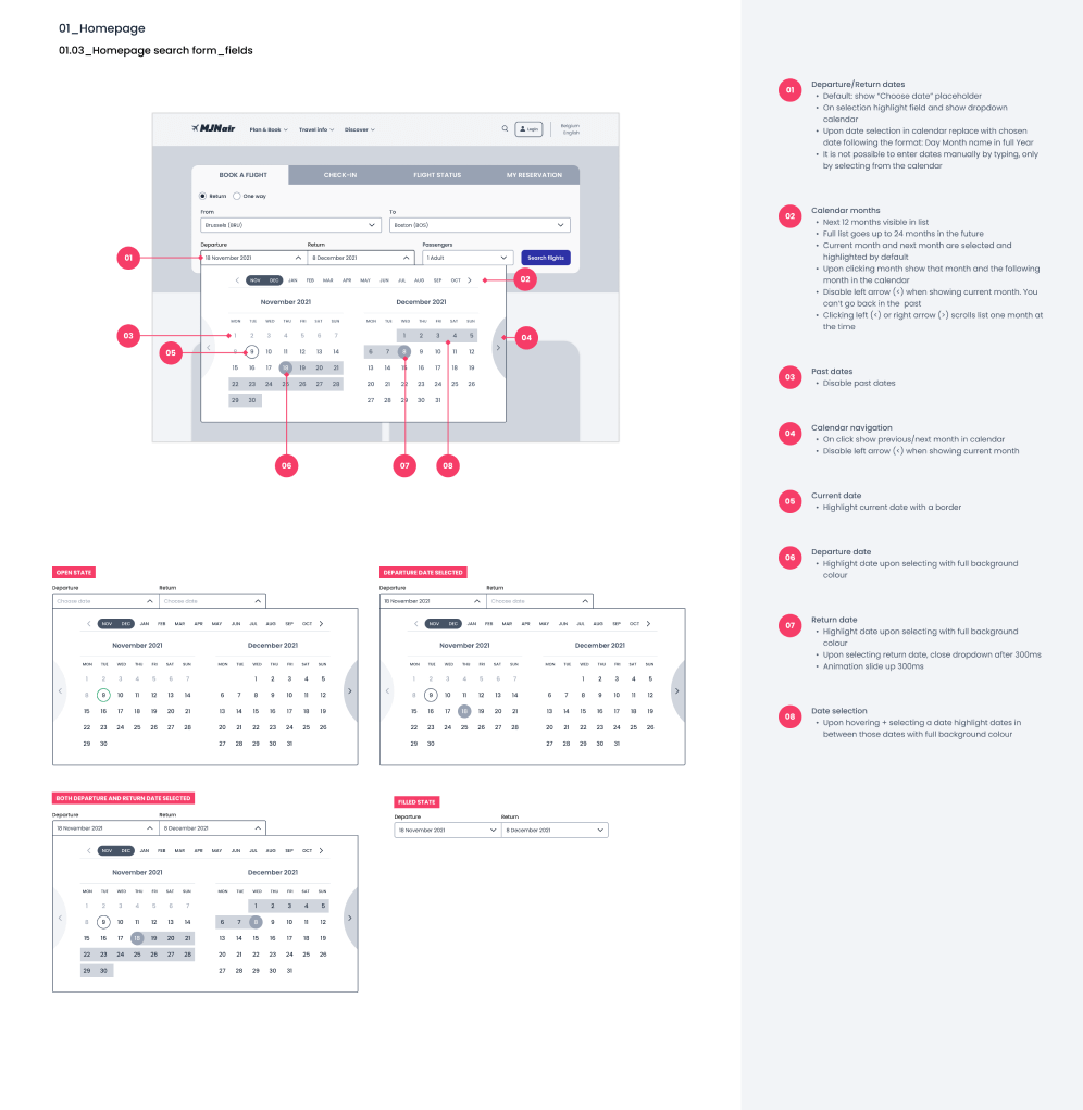
The last step was to create a document with detailed design specifications to hand over to the developers. During this step I discovered some small issues and missing details from the prototype which I fixed and tested again. I tried to design it in a way that users only could proceed to the next step when all fields had been filled out or the necessery items had been selected to prevent error messages.
Conclusion
Or as Piet Huysentruyt would say, what did we learn today?
You don't need to reinvent the wheel.
Conventions and best practices are there for a reason and users like things they know how to use.
Follow the process. You can't design and build at the same time.
One of the mistakes made working on previous projects is that me and my colleagues always built and designed at the same time. While it might seem to work faster, it is like going in blind and permanently trying to fix things “that don't seem to work” or “don't make sense”. When following the steps of the UX process, you gather all the insights beforehand, test them with users and come to a far better solution.
You don't need prior knowledge of the service or product you are designing for.
When starting out on the project it felt a bit daunting to design an airline booking process as I don't have a lot of experience booking flights. I shouldn't have worried because the research provides all the data and insights you need. Doing the competitive benchmark I got a good idea about how most airlines go about their booking process, the usability tests and customer journey
What would I do differently?
I still feel there are areas of improvement in my overall design which further testing with users could uncover.
This being a solo project, my research data was limited and I sometimes got contradictory results. A bigger set of qualitative data might have helped work out these issues.
There is currently no option to log in during the booking process. I didn't want to interrupt the user flow with a login/skip option, but it now feels like it is missing. More research and input from a developer team might bring better insights into this.
I am however very satisfied with the result and how the final project turned out.